
Color Expert Weighs in on Manufacturers’ ‘Color of the Year’ Choices
For many homeowners, a new year often inspires consumers to create a new décor inside the home. Whether they are simply looking to update the bathroom walls or are ready to take on a complete basement revamp, consumers are eager to implement the newest style in any project they take on.
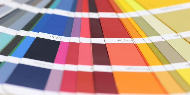
As a retailer, being knowledgeable in the latest paint trends and helping a customer create their own vision can be the difference between a sale and a lost opportunity. To help get your paint department in line with 2017’s top colors and trends, Hardware Retailing spoke with color expert Maria Killam of the blog Colour Me Happy and founder of the workshop series Understanding Undertones – The System. On her blog and website, she dishes out advice and colorful opinions on color choice, trends and design while offering several courses on her design and color system.
In this article, Killam offers her take on several manufacturers’ 2017 colors of the year and what a retailer needs to be able to share with customers in 2017. The first thing to know from Killam: Manufacturers don’t choose trends, clients and customers do.
Pantone: Greenery
Panto ne calls this nature-inspired shade of a green a “refreshing and revitalizing” selection symbolic of “new beginnings.” Killam calls it indicative of what she’s seeing in her clients’ requests across the U.S.
“I have been waiting for this color to come back for a long time. We’ve come full circle from the 70s on yellow-greens and now they’re back,” Killam says. “The grey trend arrived because consumers were craving fresher, cleaner colors and grey is the backdrop for bright color. But you’re only now seeing items that are more permanent include color, such as ranges with hoods in bright yellows and reds along with royal blue and hot pink faucets. It takes time for people to embrace a bright color.
“Paint your walls a pale grey and bring in some color. I think it’s an awesome color for where we’re at in the trend. It’s right in line with fresh colors my clients are using to decorate.”
Sherwin-Williams: Poised Taupe
 Killam is a proponent of a “greige” backdrop (lighter greys and beiges) to homes that allow brighter colors in furniture or accents to stand out. Poised Taupe, however, falls too deeply into earthy tones with its darker hue, she says, muddling the effect.
“It’s not a hot trendy color. No one is really doing earthy on walls at least,” Killam says. “It goes with muddier, dirtier colors. If the consumer is looking for something new and they pick taupe, it will likely be too dark and earthy for them.”
If a consumer is interested in taupe, Killam advises to go with a lighter shade that doesn’t draw as much attention.
Benjamin Moore: Shadow
 The darkest of this year’s featured colors, Shadow is said to work on the interplay of light and dark with its deep purple tone. For Killam, this husky shade belongs with a trend of brown hues from the 90s and early 2000s.
“In the brown trend, if someone said Shadow was color of the year, then absolutely, but today it seems kind of out of left field,” she says. “Purple is something artsy that keeps trying to be revived, but I don’t see it as a trending color this year.”
For 2017, Killam said she believes Shadow would be perfect for a front door or shutters on the exterior.
PPG: Violet Verbana
 This lighter purple, however, is right in line with Killam’s expectations for trends in 2017.
“It’s not earthy, it’s definitely a good trendy color. You could put Greenery with this and it wouldn’t clash.”
She does warn about those who would throw caution to the wind when selecting their favorite color, however. If a consumer wants purple, it still needs to be integrated into the rest of a home’s design.
“People always say, ‘If I just get my colors nailed down first, then I can decorate.’ No. It’s always best to have a starting point like artwork, fabric or a duvet. That’s when you’ll really love the color.”
Akzo Nobel: Denim Drift
 Featuring a wide variety of shades to choose from, Denim Drift leans more traditional in Killam’s view. Spanning indigo to royal blue in hues, Denim Drift also keeps with the fresh, vibrant expectations for this year’s choices.
“Denim Drift’s different shades are all pretty fresh. They’ve even got the muted choices. People have only been talking indigo for about three years, so that color isn’t going away.”
Final Tips
For retailers looking to stay on track with customer needs in their paint departments, Killam suggests keeping a few things in mind.
- “What most people are looking for is one color to repaint their house. The days of different colors in every room is over. In the 80s, color was a new idea and accent walls were big. That went on through the 2000s as well. Now, most people are looking to pick a single, fresh neutral throughout the house.”
- “There is a transition color that everyone wants. Everyone is trying to transition from the brown trend. For instance, if your house is still in the Tuscan trend, you can’t introduce cooler blue or green greys. If you can’t afford to replace existing finishes that are still Tuscan, choose a light green beige to give your interior an updated look.”
- “A lot of people are asking for white, they see white everywhere. Every fixer upper house is white, white, white. But the average builder house can’t have white walls. Say a house has an earthy tile in the kitchen or entrance. That’s when greige can be a real transition color. It’s still pale, but it doesn’t have stark white paint on their walls.”
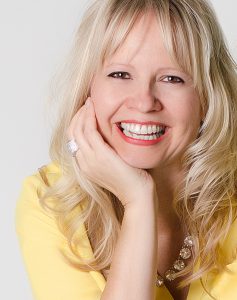
Maria Killam is the CEO and founder of Understanding Undertones Decorator, author, speaker and internationally sought after Color Expert. Follow her work at mariakillam.com.