In the summer of 2023, Mead Lumber launched a rebranding initiative aimed at updating the company’s look and creating consistency across its business units, both with employees and customers.
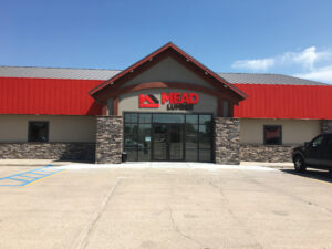
The rebranding initiative features a new, modern logo and a refreshed website, including a new URL. The operation has 53 locations in nine states, and some of the locations will be changing their name to Mead Lumber, while others will keep their name but follow the new logo and design scheme, says Barry Kriha, director of marketing, communications and branding.
 At the heart of the rebrand is Mead Lumber’s brand promise: “To Make You Feel at Home, From Design to Finish.” Kriha says this brand promise sets the operation apart from its competitors and is the reason why customers keep coming back.
“Our team worked tirelessly to develop a fresh look for our brand that better represents the quality, reliability and innovation that our customers have come to expect from us,” says Dave Anderson, CEO of Mead Lumber. “This new branding highlights our commitment to providing top-notch service and support for all of our customers.”
To celebrate the rebranding, many of Mead Lumber’s locations held celebration activities on the day of the rebranding and incorporated the announcement into their upcoming events.
“We’re proud of our history and where we’ve come from, but we’re also excited about where we’re going,” Kriha says. “This rebrand is an exciting time for us as we aim to strengthen the connection our customers have with us. We believe this fresh approach will help us stand out in a highly competitive industry and attract new customers and employee-owners as well.”
An Eye on the Goal
Kriha has been with Mead Lumber since 2021, and from Day 1, he has been focused on the rebranding initiative. Rebranding had been on the radar of leadership for several years, but until Kriha joined the team, they didn’t have the bandwidth to make rebranding a priority.
The rebranding started with listening. Kriha says he started by asking questions of Mead Lumber’s leadership and employees and then listening to the answers. He asked questions that helped shed light on who Mead Lumber was as a company, the company’s history, what customers and vendors think of the company and how the community of each store perceives the company.
 “I was trying to get a feel for the flavor of who we were as a company,” Kriha says. “It took about six to nine months for me to get a good grasp for who we are and who we want to be going forward.”
A majority of the work was done internally, as Kriha had past experience with rebranding. He put together a team of three marketing professionals, which eventually turned into a team of six. He says he also reached out to his past colleagues to spot-check his rebranding plan and provide feedback.
The rebranding went beyond a new logo and included a deep dive into the company’s core values and company culture. Kriha says company culture played a large role in the rebranding, and he was sure to include the company’s history as the first part of the brand handbook. The rebrand included an update to the company’s core values and an updated purpose statement and competitive advantage statement.
“Our history tells a story, one that many companies can’t tell or have forgotten,” Kriha says. “In the rebrand, I didn’t want to lose that history and culture that has shaped our company.”
A New Brand Is Born
After getting all the pieces of the rebrand in place, Kriha turned to bring the employees up to speed with the rebrand, which started during the listening phase. Kriha conducted employee surveys, spoke to as many employees as he could to gather feedback and used those insights during the rebranding process.
Kriha and his team presented the rebrand to leadership for approval and from there, offered a sneak peek at an employee meeting in March 2023. At that meeting, several employees provided feedback on the rebrand, which Kriha says he was able to implement before the official internal unveiling in April 2023.
Store managers and employees were given a checklist and asked to identify old branding that needed to be updated, including everything from store rugs to placard signs to delivery trucks.
 The marketing team sent celebration kits to every Mead Lumber location that included banners, flags, party poppers and other items to host a lunch with the employees at that store. Each store had the opportunity to order customer rebrand kits with shirts, coffee mugs and laptop stickers to give to the store’s loyal customers.
While the intangible aspects of the rebrand were important, the physical components were also crucial. Mead Lumber’s rebrand included big pieces like a new logo, website and store signage, along with smaller changes, such as standards for email signatures, business cards and logo use on clothing and other items.
Kriha says signage will be one of the biggest expenses of the rebrand, and it will take the company nearly two years to change out each store’s signage. He’s also focusing on digital marketing and social media to get the word out about the rebrand.
“We’ll be encouraging each store to promote the rebrand in ways that make sense for that store,” Kriha says. “We’ll continue sharing that Mead Lumber is not changing as a company, but evolving and growing.”
Hidden Meaning
Breaking Down the Significance of Mead Lumber’s Logo
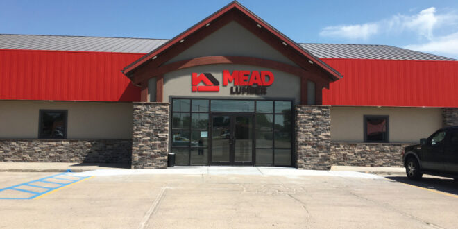
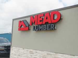 Crafted with purpose, the new Mead Lumber logo has a deeper meaning tucked into the colors and graphics. Kriha says it all starts with the cornerstone—the red square in the bottom left corner. The structure icon also highlights an M for Mead and an L for Lumber.
“The cornerstone is where you begin anything,” Kriha says. “You need a good cornerstone for not only building a career with us, but working with our customers and serving our communities.”
The words “Mead Lumber” in the logo are a unique color scheme of black and red, and the typeface symbolizes strength and a modern but timely look. The A in Mead is emphasized over the other letters and has several connotations: A+, A-Team and the operation’s first store was in Ashland, Nebraska.
“All these little elements tell the story of our business,” Kriha says. “I think the logo represents us well.”